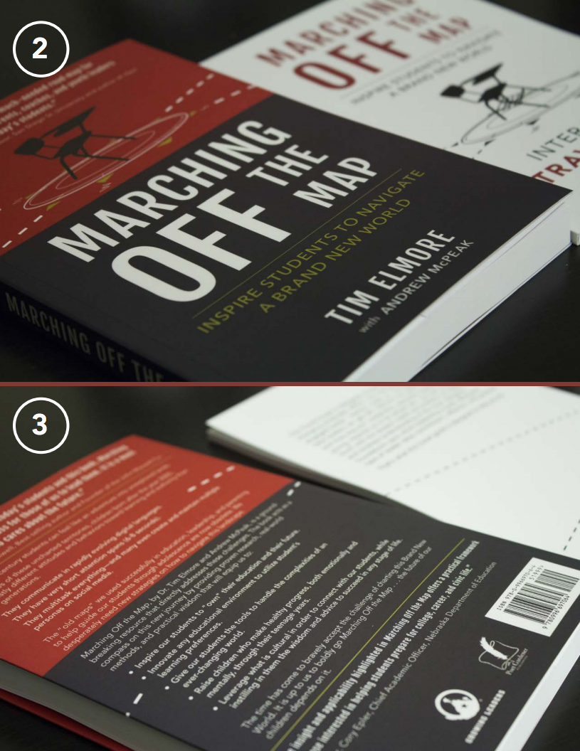
Marching Off the Map Book Cover
Designing the Cover for Marching Off the Map by Best-Selling Author, Speaker, and Philanthropist
PROJECT ROLES
Art Direction // Book Cover Design
FINAL DELIVERABLE
MOTM: Inspire Students to Navigate a Brand New World on Amazon
Photographs (Please continue scrolling below)
Background
When a best-selling author, philanthropist, and world-traveling speaker approached me to design the cover for his latest book, Marching Off the Map: Inspire Students to Navigate a Brand New World, I was beyond excited. The project presented a unique challenge: create a cover that would stand out in a crowded market of books on education, teaching, and mentorship, while effectively conveying the book's core message and appealing to its target audience.
The book aimed to provide fresh insights and strategies for educators, parents, and leaders looking to inspire students to thrive in a rapidly changing world. With such a competitive landscape, our biggest challenge was visibility. How could we design a cover that would grab attention and convey the book’s themes of innovation and inspiration in an impactful and clear way?
The Challenge
The primary challenges for the project were:
Highly Competitive Market: The book's category—education, teaching, and mentorship—was saturated with options, many featuring highly distinguished cover designs. The cover had to stand out in a crowded market to avoid being overlooked by potential readers.
User Journey and Distractions: In both online and physical retail spaces like Amazon and Barnes & Noble, book buyers face numerous distractions and options. The cover needed to draw immediate attention, enticing the viewer to explore further.
Customer Preferences: Research revealed that readers often judge books by their covers, particularly in the self-help, education, and mentorship genres. Customers were more likely to purchase a book if the cover visually communicated the book’s theme, message, and purpose.
These insights led us to a critical conclusion: the design process needed to go beyond just being "visually engaging." We needed to think of the cover as a branding project that would represent the book’s content, clearly communicate its message, and prompt engagement from potential readers.
The Strategy
To design a successful book cover, we developed a strategy centered on three main goals:
Brand Identity Representation: The cover had to reflect the brand of both the book and its author while resonating with the intended audience.
Clear Message: The cover should immediately convey the core message of the book: help students navigate a new world of challenges and opportunities.
Enticing Appeal: The cover design needed to capture the attention of browsers, whether online or in a bookstore, and motivate them to pick up or click on the book to learn more.
Research & Discovery
As part of the design process, we conducted thorough market research and gathered feedback from potential readers. Some key findings included:
Book Category Competition: The education and mentorship genre was flooded with books offering similar insights, often backed by authoritative figures. Many had strong, impactful covers that conveyed professionalism and clarity.
Cover Messaging: Consumers in this space were more likely to engage with books where the cover clearly reflected the content—books about education and self-help needed a design that communicated practical, approachable, and trustworthy themes.
Using these insights, it became clear that we were not designing a book cover just to stand out visually—we were designing a cover to speak directly to the target audience, making it clear that this was the right book for them.
Creative Process
Brainstorming and Concept Development
One of the first steps in the creative process was brainstorming key words to guide our design direction. We used these words to define the visual messaging and overall feel of the cover. The words we settled on were: Simple. Bold. Practical. Trustworthy. Education. Students.
With these keywords in mind, I dove into brainstorming and sketching potential concepts. The goal was to think broadly and freely in the early stages, exploring every creative idea that came to mind. Once I had a broad set of ideas, the team and I reviewed them together, filtering out the strongest concepts. This iterative process allowed us to refine our ideas and ensure the design was aligned with the book’s message and audience.
Visual Development
We focused on creating a clean and bold design that communicated a sense of purpose and direction. The design needed to visually express the idea of "guiding students to navigate a new world" while resonating with the audience of educators, mentors, and leaders.
In the end, we decided to incorporate visual elements that represented exploration, guidance, and the potential for growth. The cover needed to evoke a sense of empowerment for the reader, showing that this book was a roadmap for leading the next generation of students.
Throughout the process, we continually asked ourselves, “If I were an educator or mentor, would I believe this book was written for me?” This approach helped us refine the cover’s visual identity and ensured the messaging remained clear and compelling.
Final Design
After several rounds of iteration, we arrived at a design that clearly conveyed the book’s message: If you are an educator, mentor, parent, or leader of students in today’s world, this book is for you. The cover was bold and simple, with visual cues that communicated a sense of navigation and discovery, aligning perfectly with the book’s theme of helping students chart their own paths in an ever-evolving world.
Results
Upon release, Marching Off the Map quickly gained traction and became a remarkable conversational piece in the education and youth leadership realms. The cover played a significant role in its visibility and success. Key results included:
Increased Engagement: The striking, bold cover design caught the attention of potential readers both online and in-store, leading to increased clicks and purchases.
Positive Feedback: Customer feedback praised the design for its clarity and direct connection to the book’s themes, which helped build trust with the target audience.
Book Success: The book further solidified the author’s reputation as a leading global voice in inspiring the next generation of students.
The design of the Marching Off the Map book cover was an exercise in branding, focusing on clarity, visual appeal, and audience engagement. By considering market research, target audience preferences, and the competitive landscape, we were able to create a cover that resonated with potential readers and stood out in a crowded market. The result was not only a visually engaging cover but a strategic branding solution that helped the book achieve commercial success.